Welcome to the Profitto Agency Brand Center
Here you’ll find the guidelines that serve as guardrails for our brand and corporate identity. This includes the name, logo, colors, and downloads.
Our Purpose
At Profitto Agency, our purpose is simple yet powerful: to empower automotive businesses, entrepreneurs, and startups to achieve unparalleled growth and success. We exist to help our clients generate high-quality leads, amplify conversions, and dominate their market through innovative, data-driven marketing strategies.
We are committed to driving measurable results that not only meet immediate business goals but also pave the way for long-term success. By leveraging our deep expertise in the automotive industry and our forward-thinking approach to digital marketing, we aim to transform how our clients connect with their audience and stay ahead in an evolving landscape.
Our purpose goes beyond just delivering services—we strive to be a trusted partner, providing the tools, strategies, and support necessary for businesses to thrive in a competitive world.
Brand Voice
Our brand voice at Profitto Agency is designed to reflect our core values of professionalism, trustworthiness, and innovation. It strikes a balance between being approachable and authoritative, making it ideal for engaging with our diverse audience of entrepreneurs, startups, and businesses in the automotive industry.
Approachable & Trustworthy
While we bring expertise to the table, we ensure our tone remains friendly and approachable. We aim to build trust and transparency with our clients by simplifying complex ideas and maintaining open, honest communication.
Innovative
As a brand at the forefront of automotive marketing, our voice reflects innovation and a forward-thinking mindset. We embrace new ideas and encourage clients to stay ahead of trends in a rapidly evolving market.
Logo Creation
The Profitto Agency logo features a bold and minimalist design, with a prominent letter “P” accompanied by the “Profitto Agency” text. Rendered in Navy Blue (#000080), the logo embodies the agency’s core values of trustworthiness, professionalism, and sophistication.
The Navy Blue color signifies stability, reliability, and authority, all essential qualities in the fast-paced automotive and marketing industries. It also creates a sense of confidence and calm, reassuring clients that Profitto Agency provides grounded, effective solutions for their growth.
The simplicity of the “P” ensures that the logo is easily recognizable, while its modern and clean design reflects clarity and precision in the agency’s data-driven strategies. Together with the “Profitto Agency” text, the logo communicates a balance between approachability and expertise, positioning the agency as a trusted partner for entrepreneurs, startups, and businesses looking to excel in the automotive market.


Logo
The Profitto Agency logo is a visual representation of our core values and mission. The bold, minimalistic letter “P” symbolizes progress, potential, and professionalism, reflecting our commitment to driving growth and success for our clients in the automotive industry.
The simplicity of the design underscores our focus on clarity and efficiency—key elements in our approach to delivering data-driven marketing strategies that generate leads and amplify conversions. The clean, modern typography paired with the “P” icon conveys a sense of trustworthiness and innovation, positioning Profitto as a forward-thinking, reliable partner for businesses and entrepreneurs.
Overall, the logo embodies the balance between being approachable and authoritative, capturing the essence of Profitto’s brand: a catalyst for growth, innovation, and market domination.
Profitto Agency Horizontal Logo

Profitto Agency Square Logo
Profitto Agency Icon
The Colors
Our brand color palette at Profitto Agency is designed to convey professionalism, innovation, and trust. The four key colors reflect our mission to empower businesses and drive growth in the automotive industry.
#000080 (Navy Blue) – Our main brand color, representing trustworthiness, authority, and professionalism. This deep, formal blue exudes confidence and reliability, aligning with our commitment to delivering effective, results-oriented strategies.
#fcfcfc (Soft White) – Symbolizing clarity, simplicity, and transparency, this neutral color provides a clean backdrop for our content. It ensures readability and creates a polished, professional look, reinforcing our commitment to open communication.
#12161B (Deep Charcoal) – This deep, muted charcoal adds depth and sophistication to our palette, representing stability, refinement, and a subtle touch of modernity. It works well in contrast with the other colors, adding a grounding element to the overall visual identity.


Typography
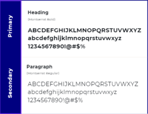
At Profitto Agency, we use the Montserrat typeface to represent our brand’s values of professionalism, modernity, and approachability. Montserrat’s clean lines and balanced proportions make it an ideal choice for a formal yet welcoming aesthetic that resonates with our target audience of entrepreneurs, startups, and the automotive market.
- Heading
- Font: Montserrat-Bold
- Alignment: Left
- Paragraph
- Font: Montserrat-Regular
- Alignment: Left
Logo crimes

Don’t use unapproved color combination.

Dont use a drop shadow.

Don’t use the logo on top of complex backgrounds.

Dont crop the logo.
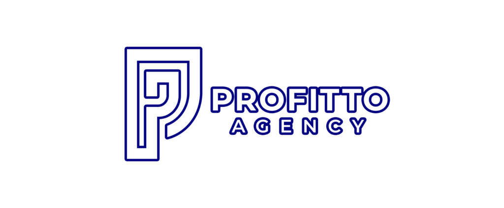
Dont outline the logo.

Don’t disproportionately scale the logo.
Illustration color guideline
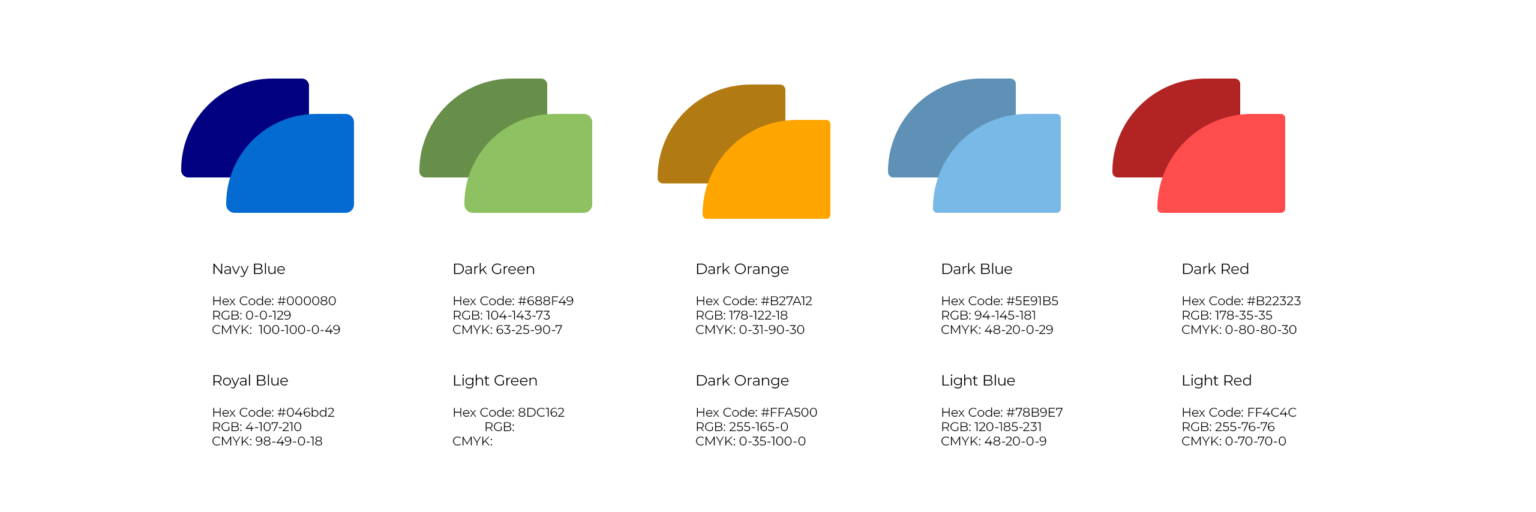
To allow us to create more depth within our illustrations, we use an extended version of the main brand palette. This expanded version of our brand colors allows to create more depth and shadow in our graphics.
These colors are for use solely in illustrations.
DO NOT USE in headlines, backgrounds or body copy.
People palette
The colors below are for designing people in Illustrations. Use colors for hair/skin/nails.

